Making Room for New Features and Functionality
Many of you use Engage message composer — our flagship product — to message your mobile app audience. But, in the past year, we've released several new products (Wallet, Connect and Insight) to help you take advantage of the rapidly expanding opportunity mobile is presenting to many businesses.
To make it easier to learn more about and use these tools, we're making some updates to the user interface over the next several weeks.
PHASE 1: March
Starting March 3, we’ll roll out minor navigation and branding changes to the Engage UI. There will be no changes to functionality at this point. This update is in preparation for the release of more robust functionality related to messaging and A/B/n testing later this Spring.
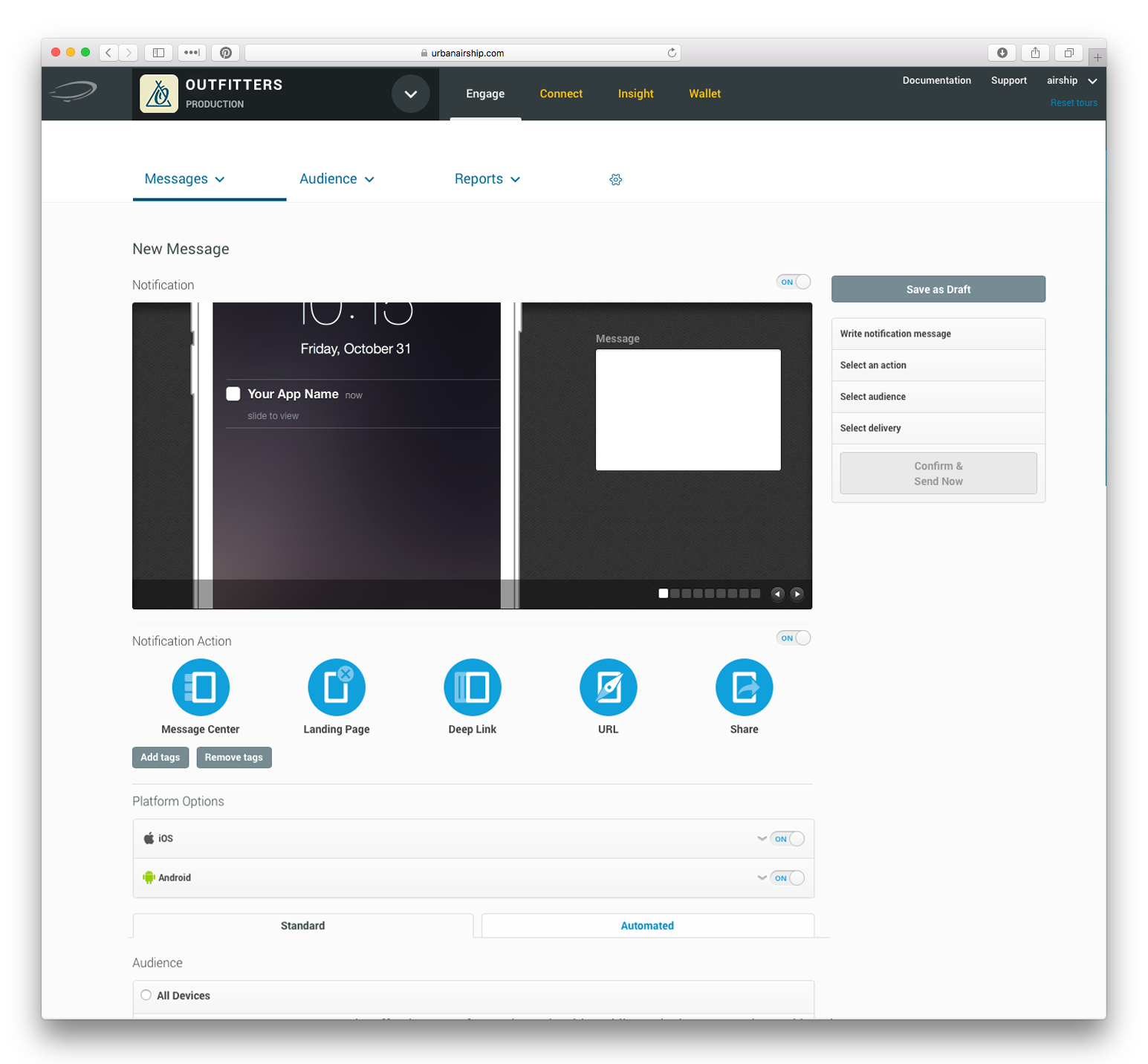
Previously, links to view Messages, Audience or Settings were arranged vertically, along the left side of the page. These links will be moved to a horizontal navigation bar, under “Engage.” We will have updated documentation and an embedded feature tour will be available to highlight and explain the changes. Any bookmarks you’ve created to sections of our navigation will still function.

Previously, the app navigation was vertical, along the left side. Now it's horizontal, across the top.
PHASE 2: Begins in Q2
Starting in April, customers will have early access to try our new, streamlined message composer and A/B/n testing composer. We will turn on permanent access to the composer in a rolling fashion.
To get you up to speed on the new functionality, we’re preparing online documentation, on-demand training videos and live training webinars in multiple time zones. We will post transition timing on this blog when finalized.
We’re excited about these changes and believe they will make it easier and more efficient for you to message your audiences and see great results.
Subscribe for updates
If the form doesn't render correctly, kindly disable the ad blocker on your browser and refresh the page.