Our New Engage Composer: A Modern Take on Mobile Engagement

Share to my network
In this article
Categories
Book a meeting
Connect with our team of experts to discuss your conversion and loyalty goals, and how we can help you achieve them faster.
Get a demoThe way businesses connect and communicate with their customers is changing forever. Mobile’s convenience and immediacy give businesses and people new ways to communicate. It takes messages that are personal, contextual and serve the customer, however, to break through the staggering amount of promotion-focused media the average consumer is bombarded with every day.
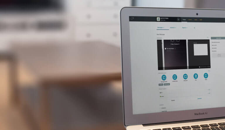
Over the last several years, we’ve added hundreds of innovations to Urban Airship Engage to help businesses deliver personalized messaging at the right time and place. Assessing that work and considering our roadmap looking forward, we decided it was time to give the Message Composer a fresh redesign to make things easier, simpler and more discoverable.
Mobile Messaging Made Easier & Friendlier
Our overarching design goal has been to make the Message Composer as easy as possible to use. And given the highly technical nature of app development, this has chiefly meant making the interface more approachable, using everyday language that doesn’t require a degree in mobile marketing to understand.
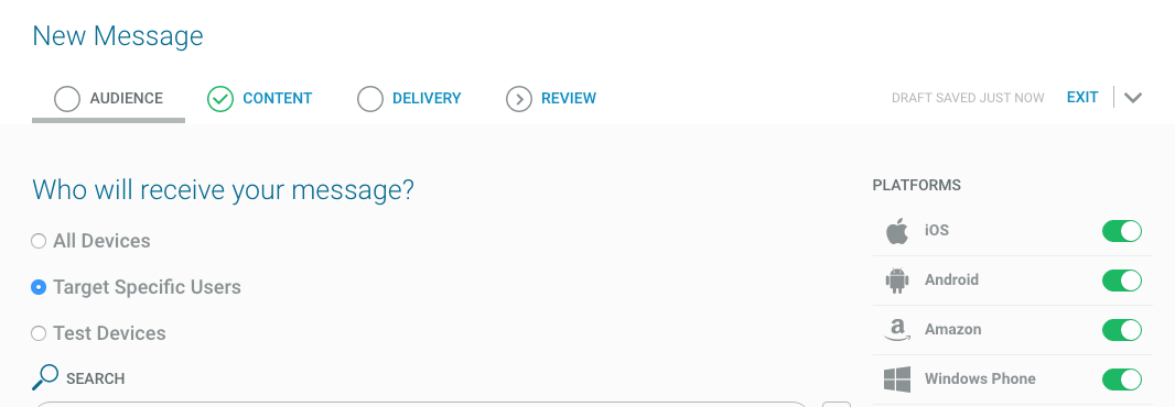
It’s also about hiding complexity — simplifying choices and making dozens of little decisions that you really shouldn’t have to think about — without sacrificing any of the power of mobile.
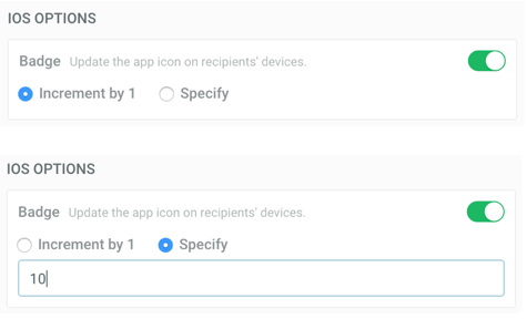
One really simple example is the iOS badge notification, a great way to drive user engagement, since it creates “badge anxiety” that drives people into your app, if for no other reason than to “see what’s up” and clear out the number (it works on me). Most of the time, customers just want to increment the number, but it’s also possible to set an exact number for it, e.g. if you never want a number to appear that’s greater than 3. We’ve improved our interface to emphasize the default behavior, while making it easy to set a new value:
In other cases we’ve decided to simplify the user experience by giving you a single field to fill out, while we figure out the complexities of making it work across iOS, Android and Amazon devices.
For example, you can now specify an optional title field on both iOS and Android. This appears in most cases for Android, but only in the Notification Center on iOS and on Apple Watch. In our new interface you don’t have to worry about any of that: just fill out the optional title field, and we take care of the rest.

Simplifying Message Preview for Hundreds of Mobile Devices
Another major shift we’ve made is to encourage the user to focus on the content of the message they’re creating, instead of worrying about how it’s going to look on any particular device or platform. Why?
A staple of mobile engagement composers on the market to date (including ours) has been the photo-realistic preview — that glossy simulation of how your message will actually look on one or more modern device: iOS, Android, Amazon and Windows.
As the number and size of different device types have proliferated over the years — we register thousand of different Android device types, in sizes ranging from phone, phablet, tablet, wearable to desktop — the likelihood that any one or even any small set of photo-realistic previews provides an accurate representation of your particular audience, has become increasingly unlikely. Every mobile audience is extremely diverse, and varies widely across different geographies and industries.

We asked Senior Engineer Helen Crowell, from our Mobile Team, to investigate the most pertinent metric: how many characters of a push notification actually appear on a range of devices? And the result was pretty astounding.
In many cases, users see no more than 89 characters of a notification on iOS, and 37 characters on Android, at least initially, since in many views the notification expands once you interact with it, allowing the user to read much more if they’re interested. For full results, see our Knowledge Base article: What are the Maximum Characters for Push Notifications.
Frontload What’s Important, and Keep It Short
As we discussed in yesterday’s post, it’s essential to keep your messages brief for maximum impact. Given this, we realized that an important thing we could do for customers to help them increase mobile engagement was to give them a tool that accounts for the many different types of devices, and the fact that push notifications are cut so short by default much of the time.
The guiding principle is: Frontload What’s Important, and Keep It Short
Make sure the essence of your message — or at least the hook — is upfront, because that’s all you can be sure will be seen by your users. But once a user is hooked, and they tap on the message, it can expand massively, e.g. up to 1283 characters on an iPhone 6, 1957 characters on an iPad, 562 characters on a Nexus 5X Phone or 536 characters on a Nexus 9 Tablet.
Message Guide
This truncation of messages is why we’ve added the new Message Guide tool to our Message Composer. It’s intentionally subtle, because it’s meant for users who are comfortable with mobile but ready to look for ways to maximize engagement through push notifications. As you type, the green dot indicator shows if your message will appear on all devices (the initial character limit varies depending on whether you have iOS, Android platforms or both enabled).
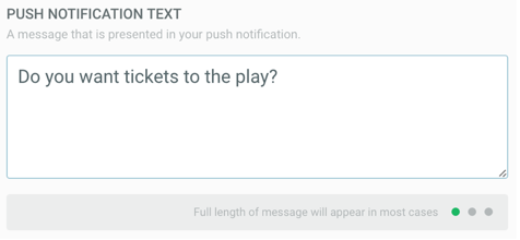
Once you pass this limit, the orange dot appears, indicating your message will now be truncated in some views:

The dots turn red when your message reaches a length that will be truncated on most devices.
Interactive, Rich Notifications
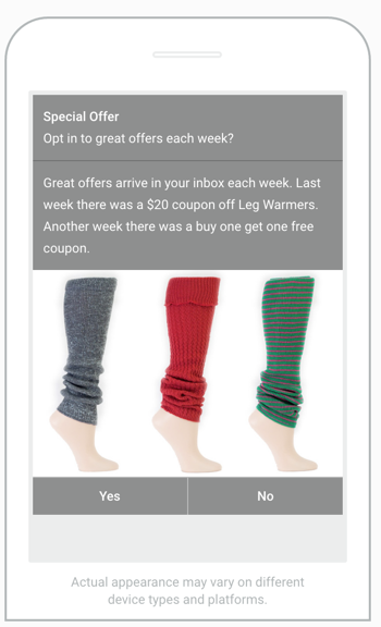
As mobile platforms have evolved, with the addition of ever-more fields, from title, summary, picture to interactive buttons, the photorealistic preview has become ever-more misleading, and even a distraction from what you really care about most: the content of your message.
This is why we provide a single, simplified view of your message while you create your content:
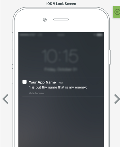
We still provide photo-realistic views during our new review step, before you send out your message, which allows you to get a feel for how it will look on different platforms, without being distracted by it during the composition process:
Discoverable Help
Finally, and maybe most critically, the new Composer better exposes the hundreds of features at your fingertips. Even if you are a long-time Urban Airship user, it’s likely you haven’t used all of our features. To make this as easy and intuitive as possible, we embedded a help indicator in just about every feature option available. Once you hover over a feature, the “?” mark appears.

That’s your cue that there is more to discover and learn. Once selected, in-context help displays right in the interface so you can get an answer to your question. If there is still more to learn, links to relevant areas in the documentation appear to provide more detail and provide examples of how to use it.
Next Steps Toward Better Mobile Engagement
We’re excited to share even more of the new Message Composer with you. Check out this 30 second video to see it in action. Better yet, register for one of our upcoming webinars (on August 24 or August 25) where I’ll be providing an in-depth walk-through and promise to show you my favorite tips to help your mobile messaging stand out.
